
What shade do you associate with passion, intensity and fiery fervour?
It’s red right?
Blue of course is a ‘cool’ colour associated with calmness, tranquility and a wonderful, ancient kind of music people used to make before the invention of autotune.
It’s no big secret that brands have been trading on our colour associations for as long as there have been brands – after all, it’s not often you see an undertaker in a pink top hat!
But what you may not know is that some estimates say that up to 34.5% of purchases are influenced by colour.
Choosing a colour for your brand is important then – and perhaps not as simple as deciding that a deep khaki really is the right shade for your dining room redecoration.
Okay. So What Are Brand Colours Then?
Well, you’ll be glad to know that the palette of brand colours does not include those ones like ‘iced smoke’ and ‘fried umber’ you have to flip though in the swatch book at the DIY shop.
There are just nine basic colours that will represent you. You’ll have to pick the right one to align with your brand values, messaging and storytelling themes.
So what do you think your brand is? Fun and quirky, or sophisticated and classy?
Your colour is going to be part of the way you get that message to your customer and it can be used across all your branded products from business cards to social media channels. Every shade evokes an emotion or feeling and that’s what you’re aiming to connect with.
Right. So what are the nine colours we’re on about?
Blue

They don’t call IBM ‘big blue’ for nothing.
One of the best known brands in the world is associated with the colour of its logo. And it’s no coincidence. Blue is the most widely used colour in branding because of the feeling of stability and solidity it generates.
Think Ford, PayPal, Barclays Bank and you’ll be able to name a dozen more off the top of your head.
Feelings of trust, loyalty and competence is what Facebook were looking for when they used blue to show themselves as trustworthy and dependable.
Red
Feeling a bit peckish?
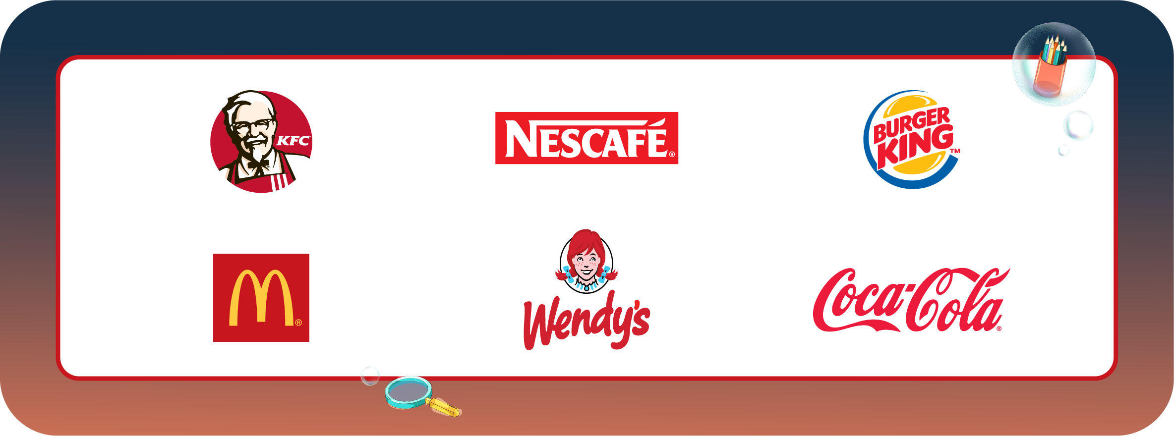
It’s probably because you’ve seen food branding using the colour red.
Yes of course, the shade signifies ardour of love, the fire of passion and the best time to put your foot on the brake at the road junction. But have you seen the number of fast food brands that use the colour?
McDonalds, KFC, Burger King? Coca-Cola is still the best known food and beverage logo in the world and it would look pretty strange in taupe.
Red represents excitement, energy and doing something right now.
Green
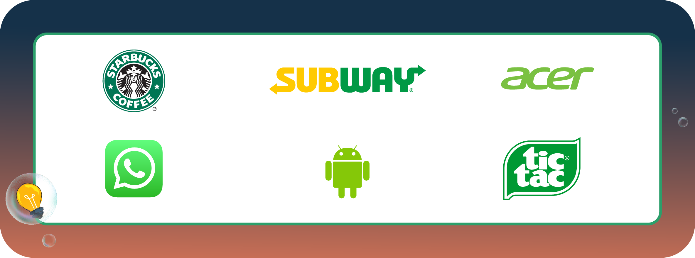
Predictable but true – green, the colour we associate with nature, well-being and of course, that current branding buzz word ‘sustainability.’ Buy green and a fresh, safe future awaits you.
Green is the only colour associated with nature and it is also the easiest for the human eye to detect.
Yellow
Remember that Donvan hit from the 1960s ‘Mellow Yellow?’ The lyric says ‘I’m just mad about Saffron…’
Unfortunately the same is not true of the marketing and branding world. Yellow is a difficult one – although it evokes feelings of warmth and joy, it is also associated with aging and decay.
Not so many brands use yellow as their primary shade, but firms like Caterpillar and Stanley have homed in on the colour’s use in warning signs to try and bring a feeling of strength and ruggedness to their brands.
Orange
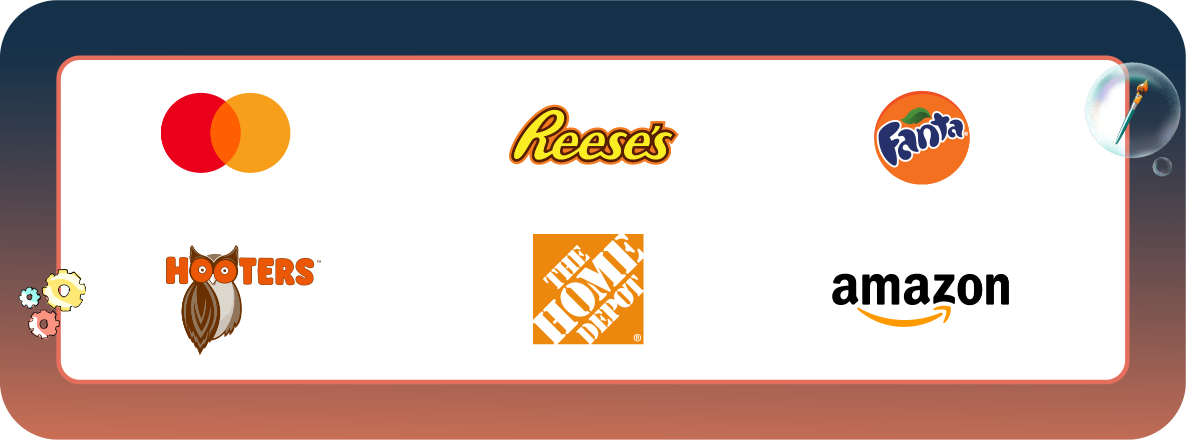
Orange is a different story. It shouts positivity and rejuvenation. It’s no coincidence that two big DIY brands, Home Depot and B&Q use orange to try and instil feelings of motivation which will hopefully inspire their customers to change that terrible dining room paint scheme.
If your brand is high-energy based, and if you’re in business for fun, then orange can be ideal. But if your brand involves high end products, you might want to avoid it.
26% of respondents in a Hubspot survey thought orange was a ‘cheap’ colour.
Brown
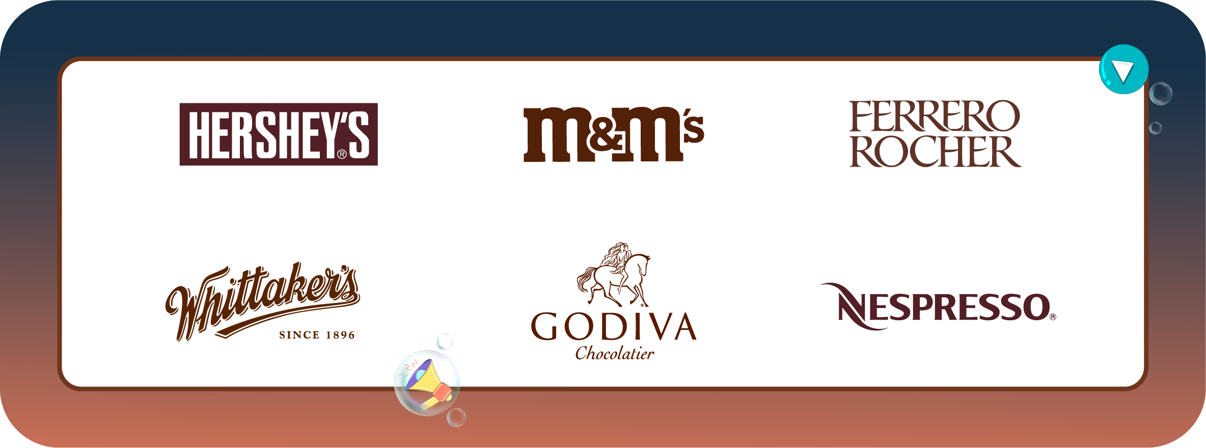
Brown is the colour of chocolate brands like M&Ms and Hershey for obvious reasons.
But the colour also reflects maturity and reliability. UPS tries to create feelings of solidity and dependability with a brown backed logo.
If your product or service centres on sophistication, reliability and comfort like Macallan scotch whiskey, then brown is a good choice. But if you are looking for a young, hip market you might want to think of another shade.
Black
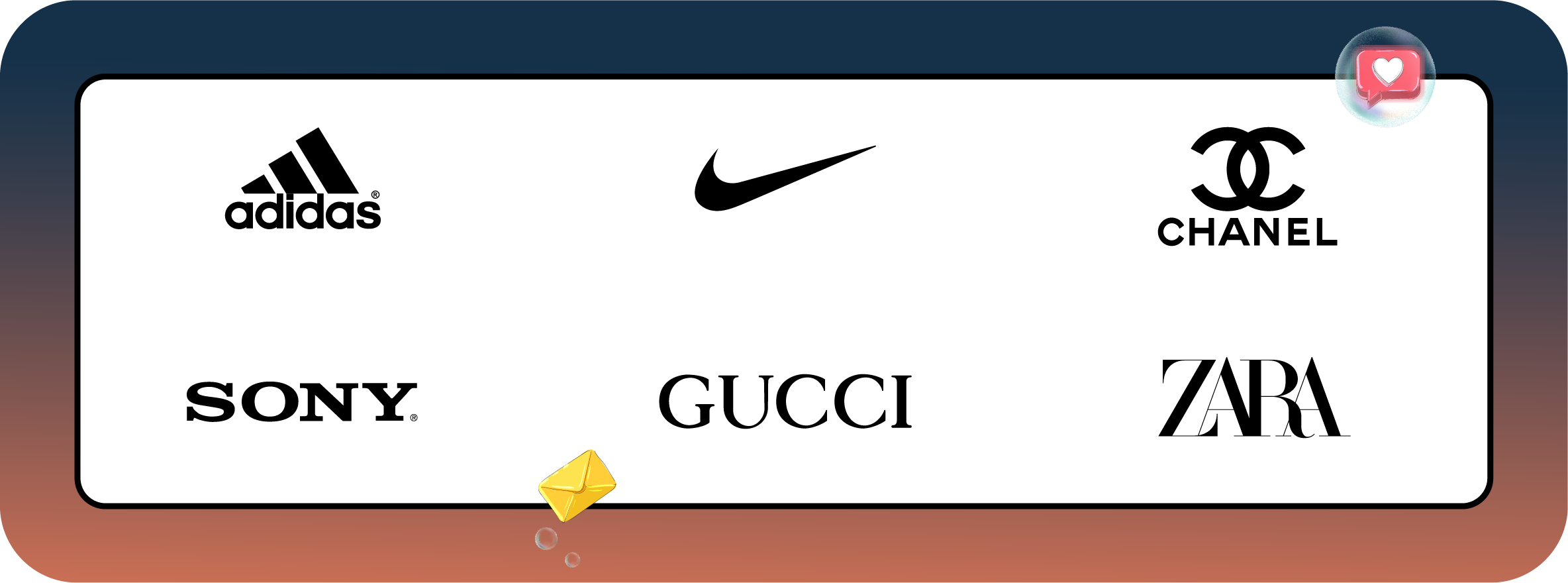
Companies that go back to black are often well established brands that are trying to tell you they don’t really need to draw attention to themselves.
It represents elegance and luxury too, which is why Chanel and Zara wear black.
Because the colour is often associated with strength and discipline, it is often used by sports brands too like Nike and Adidas.
Remember though black can often be considered unapproachable and intimidating. If you’re thinking light and casual find a lighter shade.
White
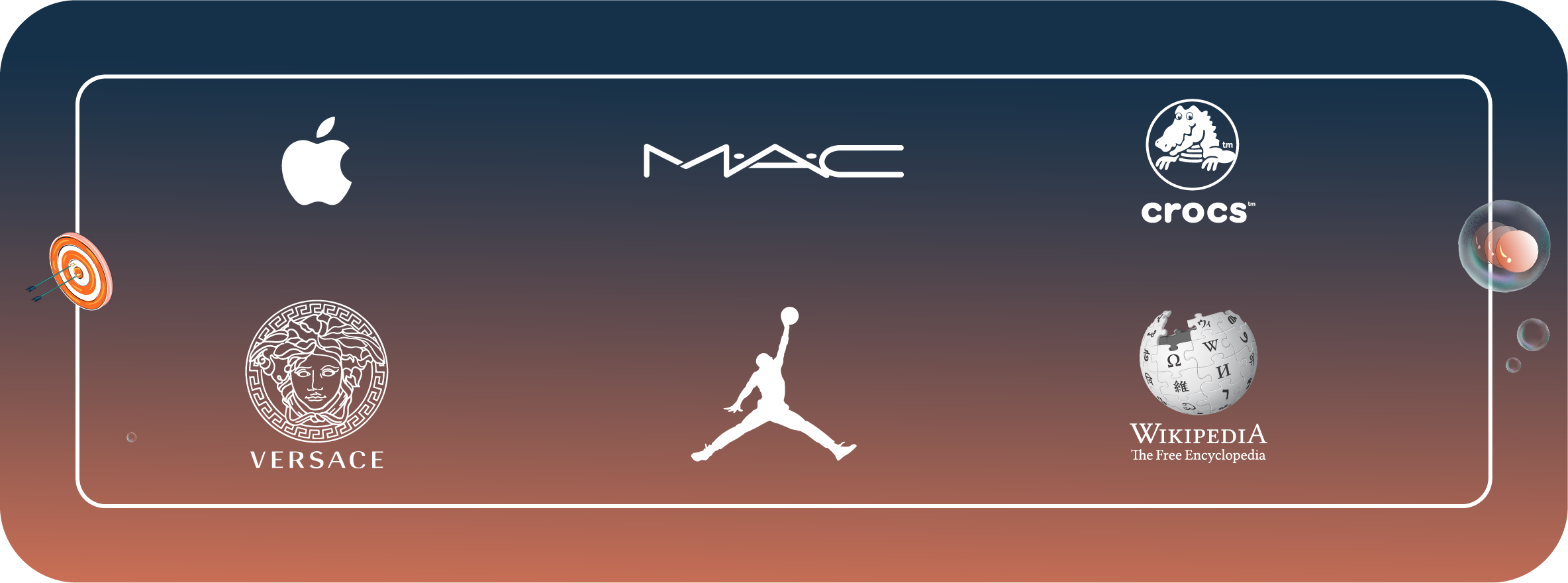
White evokes a sense of minimalism, elegance and modernity. A huge number of companies have white fonts in their branding because it stands out like no other against another colour.
Apple uses white heavily to emphasise modernity and scientific advancement. Its clean and pristine aesthetic adds weight to the company’s reputation for technological innovation.
The downside however, is white can appear plain, dull and empty. Like yellow, it’s best used with a more suggestive colour.
Pink
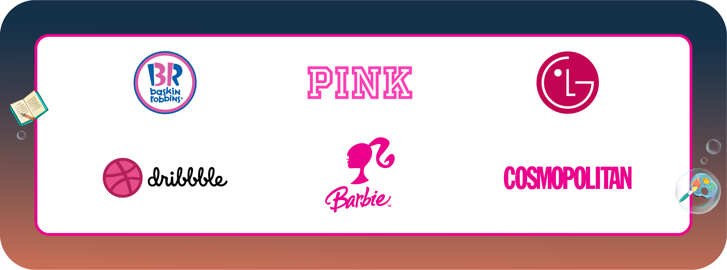
Bright, quirky and imaginative, pink is the colour of youthfulness and play. Festivals of love like Valentine’s Day use pink because of its association with ‘feminine’ traits including softness, kindness and compassion.
Of course, you’ll be pointing out that there are hundreds of brands that don’t follow the rules.
What colour are you going to choose for your new sports car brand? Well, Ferrari uses dear old ‘mellow yellow.’ And the biggest story in marketing right now is the Jaguar rebranding exercise. Have you seen the colour? It’s good old solid, dependable – brown.
And there is the world of gradients and ombrés to consider — think of the Instagram logo as a prime example. That’s worth an entire post in itself.
If you’re still in the shade, reach out and we’ll help you succeed…with flying colours.