The most legendary logo story in the history of branding begins in 1971 when accountancy teacher Phil Knight approached a graphics student at Portland State University and asked her to create a design for his company, Blue Ribbon Sports.
Carolyn Davidson submitted half a dozen designs, and yes, the one Knight and his team chose to go on the side of their trainers was the ‘Swoosh’ – inspired by the wings of Nike, the Greek goddess of victory.
‘Well, I don’t love it, but maybe it will grow on me,’ said Knight. He’s now worth $33 billion dollars, so maybe it did.
As for Davidson, she was paid $35 dollars – although Knight did buy her a few Nike shares later on.
Turning your company message into a simple symbol is never going to be as easy (or cheap) as stumbling across a genius graphic designer and throwing her a few quid.
You’ll want something that, like Davidson’s effort, is instantly memorable and gives your audience an insight into your company. And if you are going to brief a designer, you’ll need to be able to help them define what that might be.
![]()
A logo is an image, or a mix of text and imagery that represents your company and hopefully manages to suggest pictorially what you stand for.
The best logos are easily translated across different mediums – whether it’s a business card, signage, website or a social media app. The aim is for it to be instantly recognisable wherever it is, like the McDonald’s golden arches. FedEx on the other hand, has extra meaning built into the design.
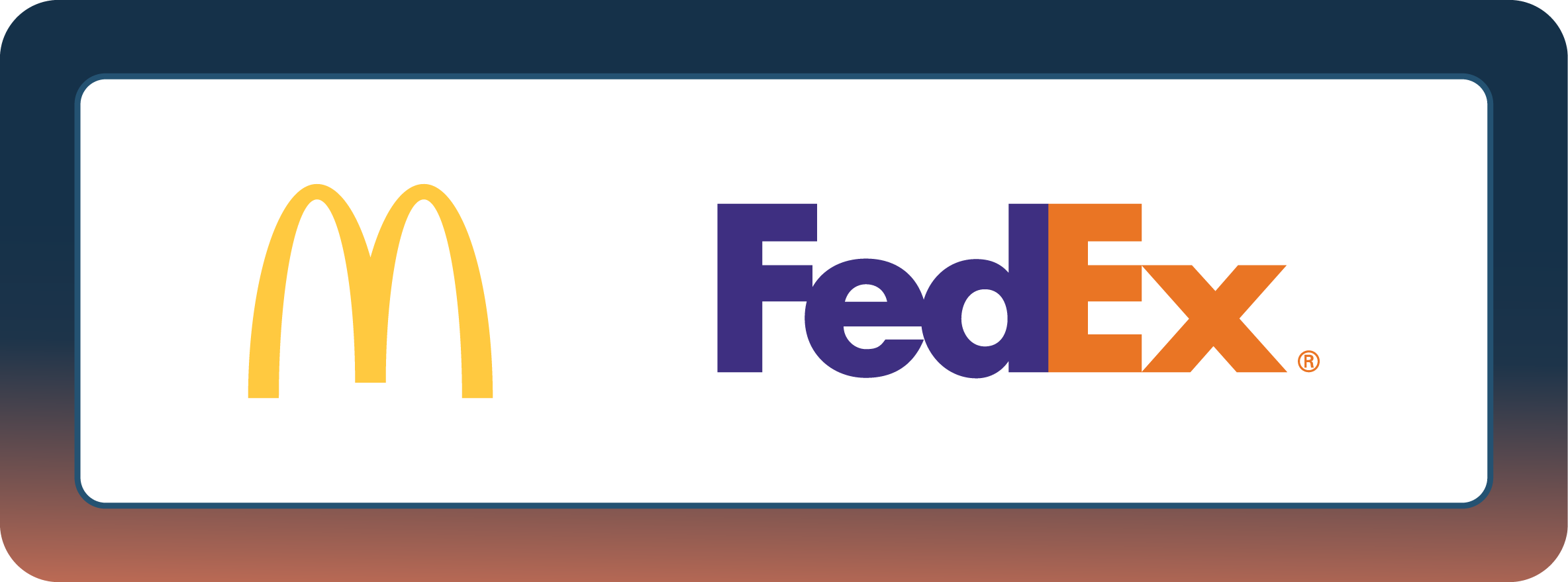
The gap between the ‘E’ and ‘X’ creates an arrow pointing forward representing speed, precision and delivery.
Both logos have different approaches to the problem and yet they are both highly effective.
![]()
Once you know what you want your logo to say, you’ll need to bear these rules in mind:
- Keep it simple
- Make it memorable
- Be original
- Be current yet timeless
- Balance is key
- Make it complement text and image
- Make it work in all mediums
Keep It Simple
Compare the paintings ‘Mona Lisa’ and ‘The Last Supper.’ You’ll have a basic idea of what both are about and what’s in them, but perhaps the Mona Lisa is easier to recollect. Why?
It’s because it is a simple subject of a woman smiling. There’s a lot going on in The Last Supper which means it is difficult for the painting to convey a direct message as the Da Vinci portrait does.
It’s the same for logos. Fussy, detailed designs will dilute the impact. Minimise your colours, shapes and fonts. Trying to do something fancy can lead to horrors like this:

Most people need to read this three times before they even understand what it says and the design is so tiring on the eye it makes you want to look away.
Make it Memorable
Simple logos like Steve Jobs’ Apple are likely to be more memorable. The company’s initial logo was of Isaac Newton sitting under a tree, until Jobs hired a designer to uncomplicate matters and he came up with the bitten fruit we all recognise today.
If you allow the graphic to get over stylised you can end up with disasters like this:
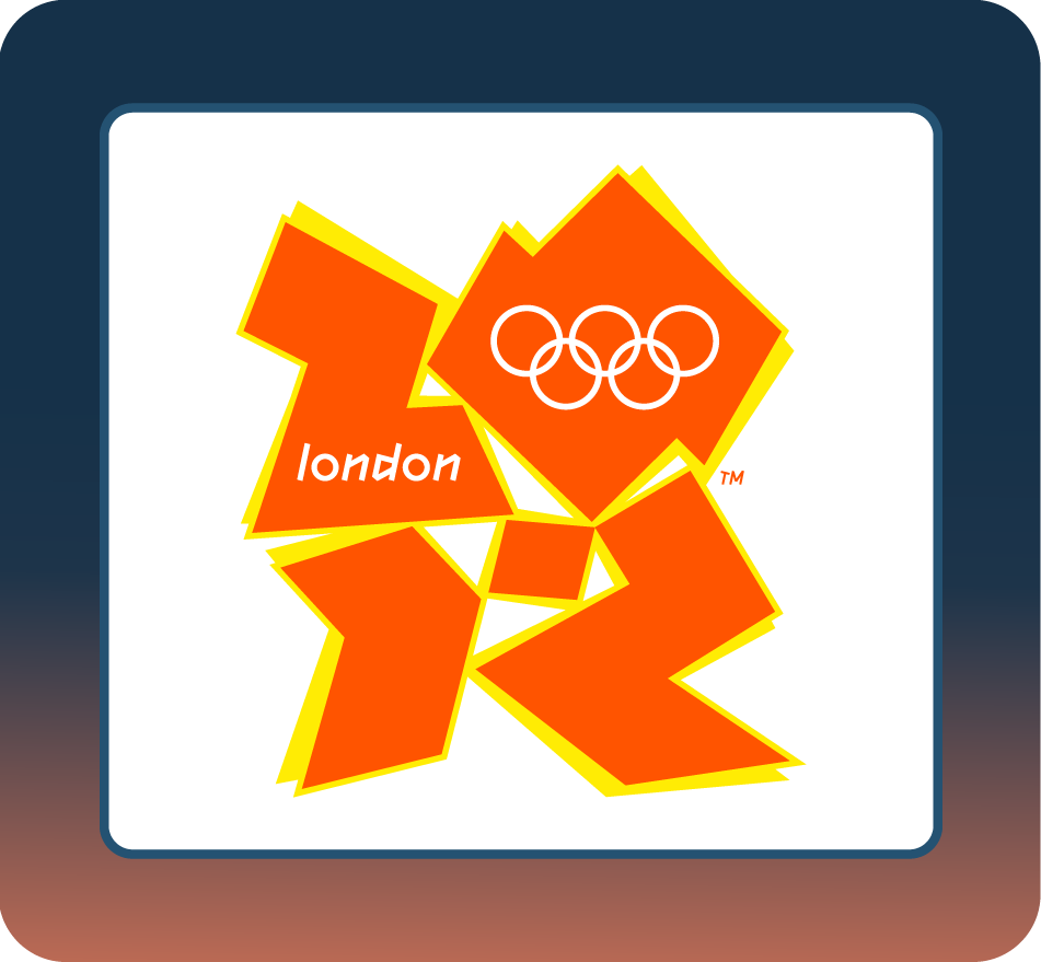
Even when you know this is the London Olympics logo it still takes an age to ‘read.’ It’s hardly surprising so few people remember it – it is so unappealing that most of us will make a very serious effort trying to forget it.
Be Original
To be memorable, your logo will need to look fresh. If it is a bit like something else, you’ll just end up confusing potential customers.
You can search logos in your field to see how other companies have solved the problem. Most dentists will use a tooth in their design for example, but if you are in the drilling and filling business you’ll need a way to make your molar design look new and er, incisive.
Current, Yet Timeless
Make your logo current, but don’t allow it to become outdated. The challenge of keeping a symbol relevant is why companies tweak an image while retaining the original concept.
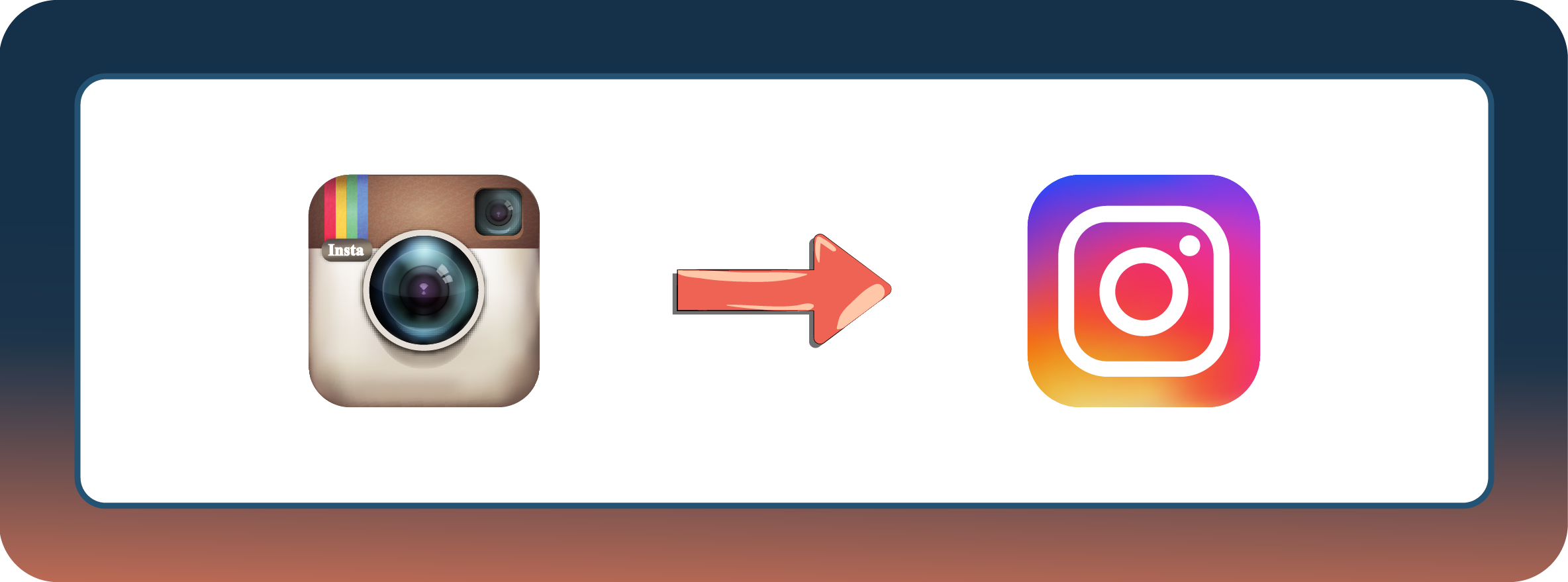
Brands like Instagram (above), Starbucks and Shell have made changes to their logo while keeping the same basic premise.
Don’t mistake modern for trendy. Trends come and go. A modern symbol will stick around because it’s less stylish and more restrained. You’re aiming to make a logo that carries your relevant characteristics but remains clean and uncluttered.
Balance is Key
One of the designer’s crucial jobs is to maintain balance through proportion and symmetry. If the font, text or image looks out of place, the logo will lose its essence.
Keeping logos centered will give it an pleasant aesthetic quality that makes it easy on the eye.

Make it Complementary
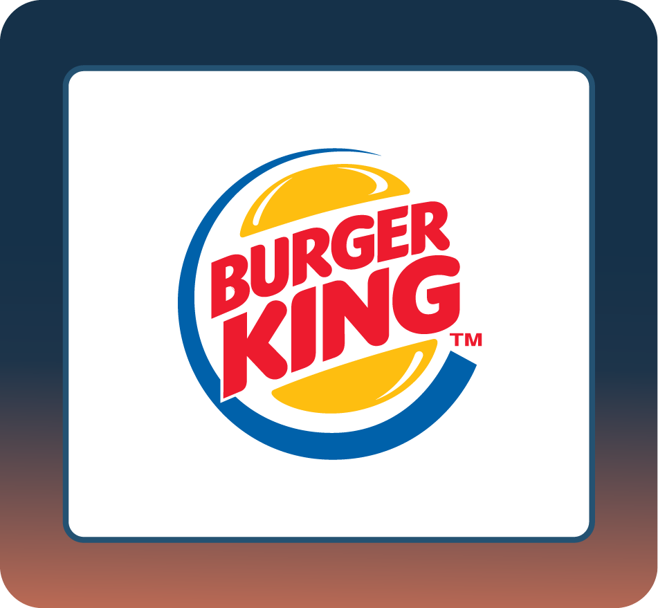
Logos aren’t a choice between image and text. While Shell has taken the text off the graphic, ZARA uses text alone. Combining both can work too, as with Burger King and Carrefour.
Make sure that your image and text complement one another. If either element is out of place, the whole logo will suffer
Works In All Situations
Even as a small business, you ought to have big goals. One of them is having a logo that can work everywhere at any time. In a globalised market, where the internet and social media are vital platforms, your logo will be used in multiple ways and contexts.
Whether it’s on t-shirts, social media ads, black or white backgrounds or food wrappers, the logo has to shine out. A good designer will know how to make your logo maintain its identity wherever it appears.
The designer will also need to ensure that the logo:
- Displays the message of your brand’s core values
- Relies on Pantone colours
- Does not create unnecessary or overdone elements
- And tests its effectiveness before launch
Displays the Message of Your Brand’s Core Values
When you look at a logo, you are receiving the brand’s values without realising it. Think of YouTube. A red curved rectangle with a play symbol in the center. The image itself says that this is where videos play on a screen, while the message says this is where people find entertainment and community.
You and your designer need to try and incorporate the purpose and qualities of your brand in your symbol too.
Rely on Pantone Colours
Certain colours may look beautiful on a screen, but hideous when they are printed. To avoid this, it’s best to rely on Pantone colours.
Pantone colours are a vast library of shades categorised into a colour matching system called the Pantone Matching System. Colours are given codes or numbers for precise identification. With this, errors with material, lighting and mediums are avoided.
Everyone has a different perception of colour and your idea of what blue looks like will be completely different to someone else’s
PMS is used in graphic design, fashion, print, product manufacturing and interior design, so when you specify a colour, the designer will know which one you are referring to by checking the code.
Remove Unnecessary or Overdone Elements
Adding too much detail makes it difficult for the audience to remember. Focus on the essentials that define your logo and trim excessive detail.
Test Its Effectiveness Before Launch
Before you commit to a logo, gather a test audience, show it to them and ask for their opinions. If you don’t get the desired response it’s back to the drawing board for you and the designer..
You’ve seen enough horrendous logos to know that creating one that is right for the brand is never an easy task. Some companies have thrown vast amounts of cash at design teams and still come up with the proverbial dog’s dinner. If you’d prefer not to join them, give us a shout. It won’t cost you a vast amount of cash, and we’ll make your brand look as clean as a hound’s tooth.